Michelle Alpert Photo & Design
Design Projects / Ideas

This is the primary front cover for the magazine. Each front cover would showcase a striking photograph without any text. The idea is for the photograph to be intriguing enough for the reader to open the magazine and view the table of contents to see what is in this issue.
This is another example of a potential front cover for another issue.

This is the primary front cover for the magazine. Each front cover would showcase a striking photograph without any text. The idea is for the photograph to be intriguing enough for the reader to open the magazine and view the table of contents to see what is in this issue.
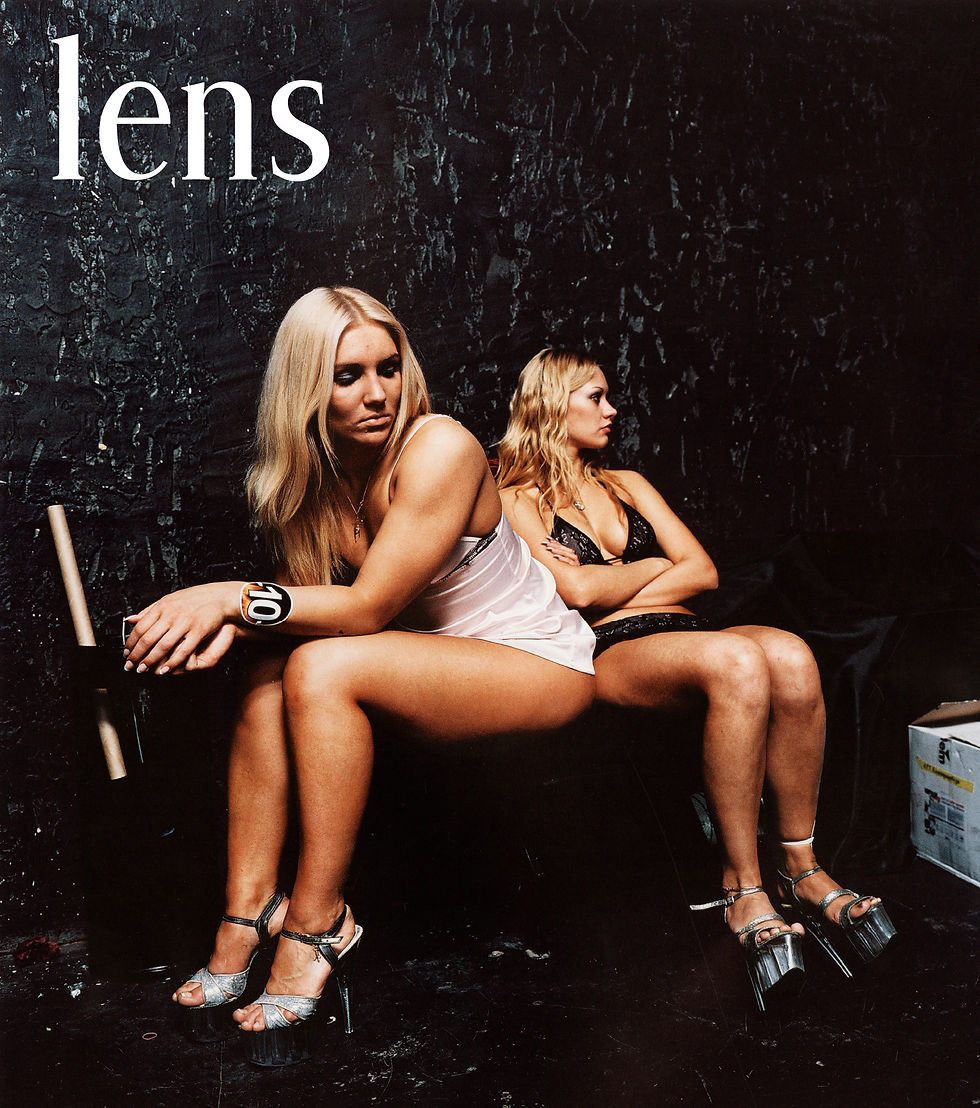
"lens" Photography Magazine // Pilot Issue
This is an example pilot issue of a photography magazine idea that I created from the ground-up, "lens". I considered the branding and atmosphere of the magazine, that it would be an exciting and in-depth magazine, featuring professional photography. [For the purpose of this project, I pulled the content from the real magazines
which inspired my idea, such as "aperture" and "eyemazing."]
I choose the color scheme, font palette, designed the page layouts, the by-lines and page footers/ pagination. I even designed the little camera icon which is placed at the end of each article.
The target audience would be any artist or open-minded creative person interested in the current happenings in the photography world. It would showcase and review recent or upcoming gallery shows, books, events, published series or awards; as well as feature interviews with both seasoned and up-and-coming rising star photographers. Other featurette articles would be things like "tech tips."
The objective of the magazine would be to inform, inspire and excite & entertain!

Detail shot of the outside front covers of the self-mailer newsletters, both the Winter and Summer issues.

Detail shot of the inside covers (the backside of the outside cover) for both the Winter and Summer issues.
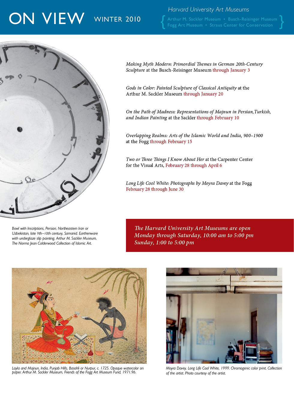
This is a supplemental insert sheet which would be included within the fold-up main newsletter. This insert showcases the current & upcoming gallery exhibitions, as well as a calendar of events on the other side.
Detail shot of the outside front covers of the self-mailer newsletters, both the Winter and Summer issues.
Harvard University Art Museums // Self-Mailer Newsletter
This is a hypothetical newsletter design for a quarterly publication for the Harvard University Art Museums. Harvard has a group of Art Museums on campus which sends out to members the folded, self-mailer newsletter called "Building our Future"
I designed two issues to showcase the atmosphere and serial cohesive features of the issues, as well as illustrate a level of variety and individualism with each issue. I created a Summer and Winter issue. Each issue also included a supplemental insert sheet for an "On View" and "Events Calendar" listing for the Gallery Exhibitions and Musem Events.
*(the content, images and copy, was provided by the professor for the Publication Design class which this project was for.)
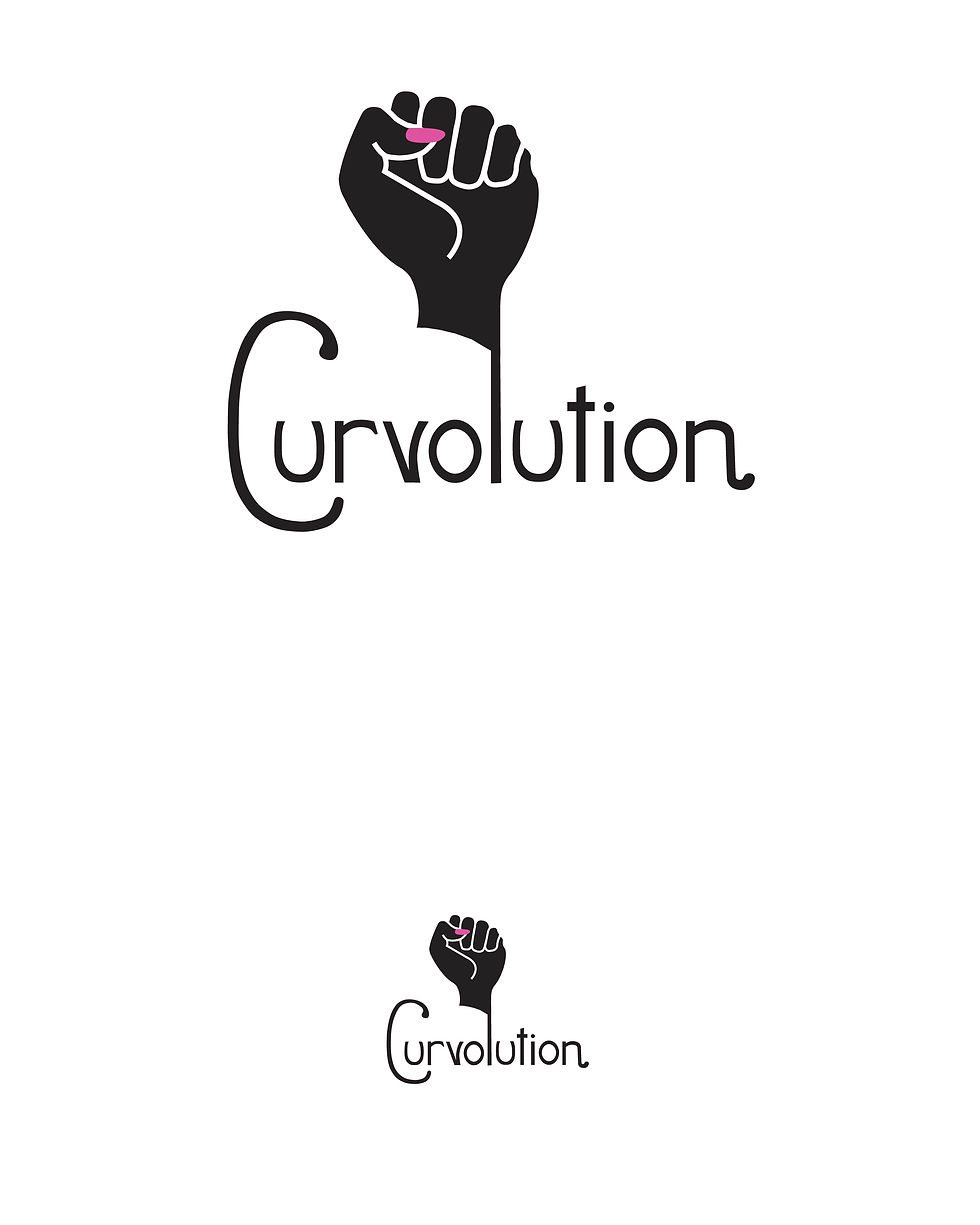
A revolution for your curves, "Curvolution" jeans will fit you perfectly with their special curve-enhancing technology. The logo is meant to be reminiscent of the classic military, fighting fist graphic. Often associated with rebel causes, the strong and striking imagery of the fist is balanced and targeted for the feminine audience with the pink fingernail.

One version of the magazine advertisement series.

This is a digitally-created image of what the logo would look like on the leather brand patch on the back of the jeans.
A revolution for your curves, "Curvolution" jeans will fit you perfectly with their special curve-enhancing technology. The logo is meant to be reminiscent of the classic military, fighting fist graphic. Often associated with rebel causes, the strong and striking imagery of the fist is balanced and targeted for the feminine audience with the pink fingernail.
Curvolution Jeans // Logo & Branding
This is a hypothetical brand of new, high- fashion jeans which are aimed to have the perfect fit with "curve-enhancing technology." The jeans have this lifting element where the idea is that it's revolutionary technology which gives you a revolutionary fit and enhancement in your curves, thus "Curvolution." I thought of the company name, designed the logo and all branding elements as well as examples of an ad campaign.
The target audience would be woman between the ages of 30-50, and most especially mothers who want to avoid being uncomfortable in teen-style jeans. This branding campaign includes magazine ads, merchandise tags and digitally composited images of the logo in real jeans.

This is my re-working and re-design of the Nations Aquarium's logo. The real logo is currently circular with dots inbetween the rows of waves so that they also sort of look like fish as well. I decided to relate the shape of the logo to the recognizable & well-known shape of the building, and to simplify the pattern to minimalistic waves to reference the general ocean rather than fish only.

This would be the new Membership Card given to National Aquarium Members.
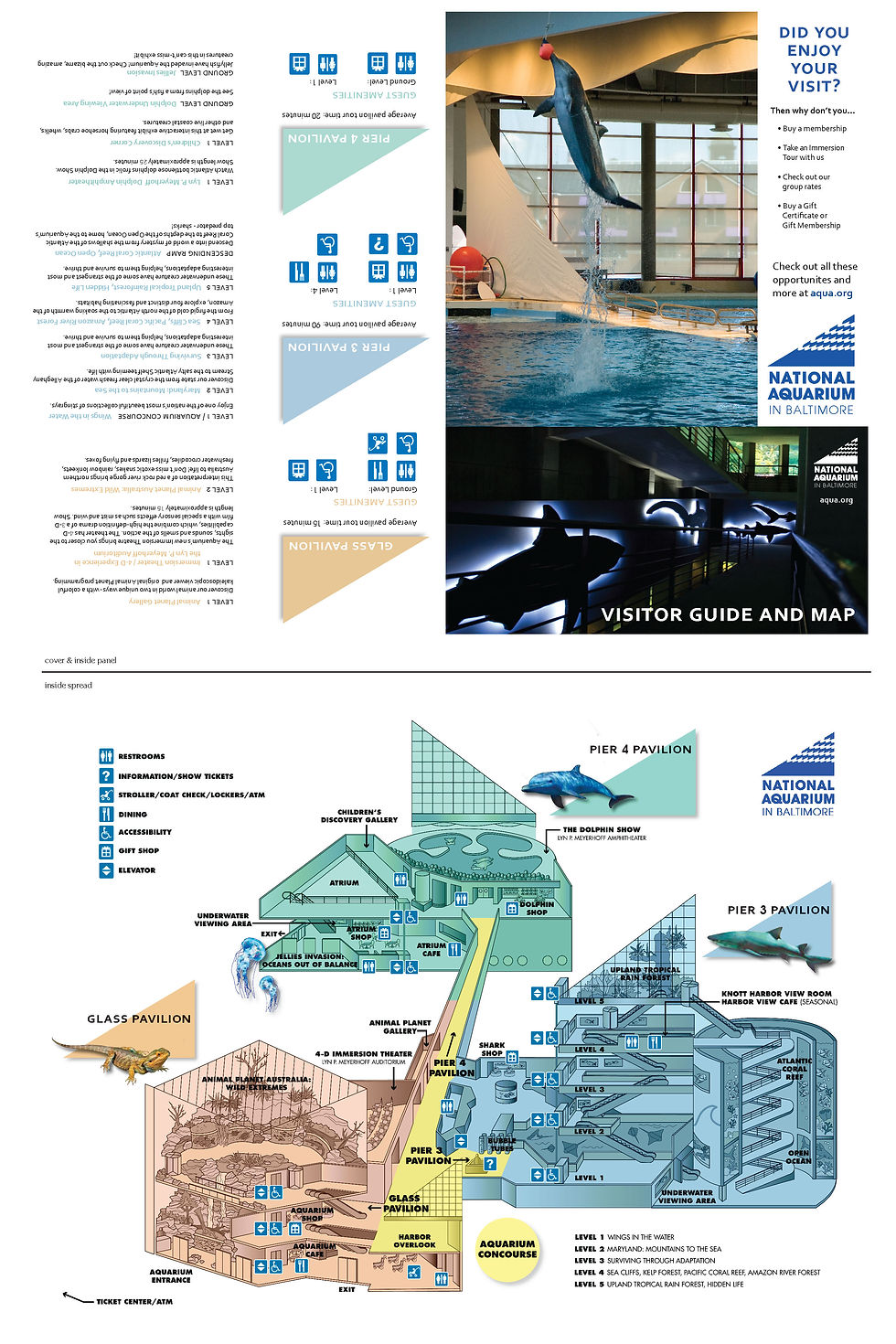
I used the current real aquarium map as a base, but changed some graphics, some layout elements and color scheme according to to my new version of the logo. Also used my own photography that I shot at the aquarium to be used for the front and back covers of the map/guide.
This is my re-working and re-design of the Nations Aquarium's logo. The real logo is currently circular with dots inbetween the rows of waves so that they also sort of look like fish as well. I decided to relate the shape of the logo to the recognizable & well-known shape of the building, and to simplify the pattern to minimalistic waves to reference the general ocean rather than fish only.
National Aquarium in Baltimore // Logo Redesign
This is my hypothetical re-working and re-design of the Nations Aquarium's logo. The real logo is currently circular with dots inbetween the rows of waves so that they also sort of look like fish as well. To update the logo, I decided to relate the shape of the logo to the recognizable & well-known shape of the building, and to simplify the pattern to minimalistic waves to reference the general ocean rather than fish only.
I also designed a new visitors map with a new color scheme and changed graphics, as well as a new Aquarium Membership card.

Hypothetical concert poster for recent show if the lead singer of Sublime had not died.
Hypothetical concert poster for recent show if the lead singer of Sublime had not died.
Sublime // San Francisco Concert Poster
This is my poster design for a hypothetical/ fake concert for the band Sublime, if their lead singer had not died in 1996.
The idea was to imagine what kind of a show and what kind of artwork the band would be using currently if they were still intact with all the original members.
I imagined a show in California, and choose to utilize the iconic Golden Gate bridge. I was hoping to illustrate that the Bay area and the bridge would be absolutely rockin' and stirred up from the music of the concert. I was inspired by the artwork from the band's previous albums, and I also illustrated graphic elements which reference specific songs. ("Pool Shark" and "Badfish", etc.) I researched a real venue in San Francisco which seemed fitting for such a show, "The Independent." I tried to incorporate all show information as fitting into the subject matter of the illustrations.
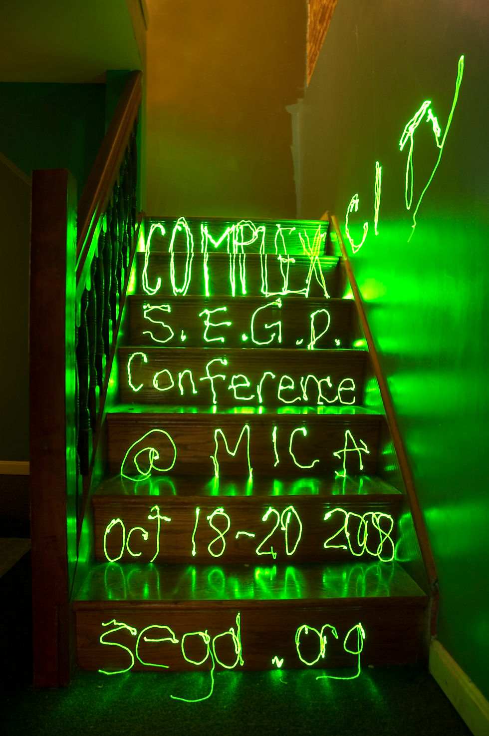
The Society for Environmental Graphic Design Conference Poster "Complexcity" was the name of the conference event.
The Society for Environmental Graphic Design Conference Poster "Complexcity" was the name of the conference event.
Complexcity // Conference Event Poster
This is my poster design for a hypothetical conference by the Society for Environmental Graphic Design. (S.E.G.D.) This conference was titled "Complexcity" and the main focus was designing for the specific space or environment in which the design was going to be.
The SEGD strives to "create communications that exist in the three-dimensional built environment," and "design elements that communicate stories, messages, information or feelings."
I utilized the environment of the dark basement stairs and created this image by writing in the air with a strong laser pointer while the shutter of the camera remained open. This recording of a temporary existance of the light interacting with the environment of the dark staircase felt like a great way to illustrate and communicate the ideals of the SEGD while simultaneously advertising their event.